Dr. Robin E. Bowen, president of Arkansas Tech University, introduced a new academic brand identity for the institution to faculty and staff during a beginning of the spring 2020 semester meeting at Witherspoon Auditorium.
About the Process
The brand identity was developed in collaboration with marketing firm Carnegie Dartlet, which conducted qualitative and quantitative research to develop and test a variety of logo concepts. The ATU Board of Trustees reviewed options during its December 2019 meeting and selected ATU’s new brand identity.
Feedback from the ATU community captured by Carnegie Dartlet described the selected brand identity as “clean, geometric, innovative and future-forward.”
The Carnegie Dartlet team worked to develop a logo that is reflective of institutional personality characteristics uncovered during phase one of the ATU brand identity project.
Where We’ve Been
Dating back to its days as Arkansas Polytechnic College, the institution now known as Arkansas Tech University has consistently evaluated and adjusted its brand identity to match the times.
Below are examples of some of the brand identities at ATU over the past half-century.


Where We’re Going
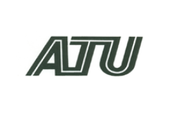
Respondents to a national survey described the new ATU logo as “strongly memorable, distinctive, attractive and understandable.”
The gap in the “A” is intended to reflect innovation. The joining of the “T” and “U” represent collaboration. The arm of the “T” angling in concert with the bar of the “A” hints at transformation and teamwork. The overall weight and boldness speaks to passion and tenacity. The gold outline is reflective of how ATU empowers its students.
ATU will begin integrating the new academic brand identity into its marketing and communications during the calendar year 2020.


